THE ORDINARY CASE STUDIES
The Ordinary Skincare Regimen Builder
Skills: UX Writing, Systems Thinking, User Insights
Tools: Figma, Google Workspace
THE CHALLENGE
The Ordinary Skincare Regimen Builder aimed to guide users to the right products, but feedback showed that too much science jargon made the experience overwhelming. The challenge was simplifying complex terms while keeping the brand’s clear, approachable tone.
THE STRATEGY
To make the quiz user-friendly, I collaborated with the brand, science communications, regulatory, and legal teams to align on simple yet scientifically accurate terms. This approach ensured that each step of the quiz used approachable language while staying true to The Ordinary’s commitment to transparency and precision.
THE RESULT
The new copy strengthened The Ordinary’s reputation for transparency by making complex skincare concerns and ingredients more accessible to all users.
THE ORDINARY DIGITAL GIFT CARDS
THE CHALLENGE
The Ordinary was launching digital gift cards and adding a dedicated section to its e-commerce site. The challenge was highlighting the gift card's value to users while maintaining the brand's clear, straightforward tone.
THE STRATEGY
I used simple, clear language to highlight the gift card's flexibility. Working with the Head of Brand, I crafted copy that made the digital gift card feel easy to use, aligning with the brand's emphasis on simplicity.
THE RESULTS
The Ordinary Digital Gift Cards are an appealing alternative to product purchases, enhancing the shopping experience. The copy positions the gift card as versatile and expected to drive engagement during high-traffic periods.
THE ORDINARY MOBILE APP
I created the following case study for my UX Design class at Seneca Polytechnic.
THE CHALLENGE
The Ordinary has a strong online presence and a loyal following but lacks a mobile app. The challenge was conceptualizing an app that would simplify users' skincare journeys while building trust through an intuitive, needs-based experience.
THE STRATEGY
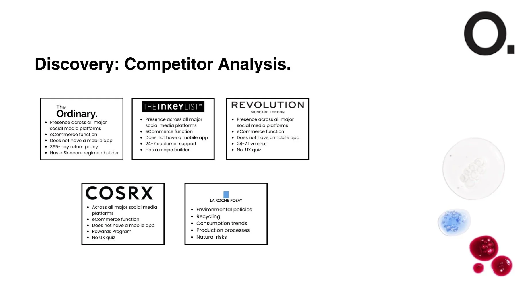
I centered the app concept around The Ordinary's Skincare Regimen Builder, adapting it to fit a mobile experience focused on ease and accessibility. I identified features supporting Generation Z's preferences through market research, competitor analysis, and user interviews, emphasizing clear, practical guidance.
THE SOLUTION
The proposed app concept showcases a quiz-centered experience to prioritize user needs, making product recommendations easy to navigate. The design, from wireframes to high-fidelity prototypes, aimed to blend usability with The Ordinary's signature straightforward tone, creating an experience that could effectively engage and support users.


